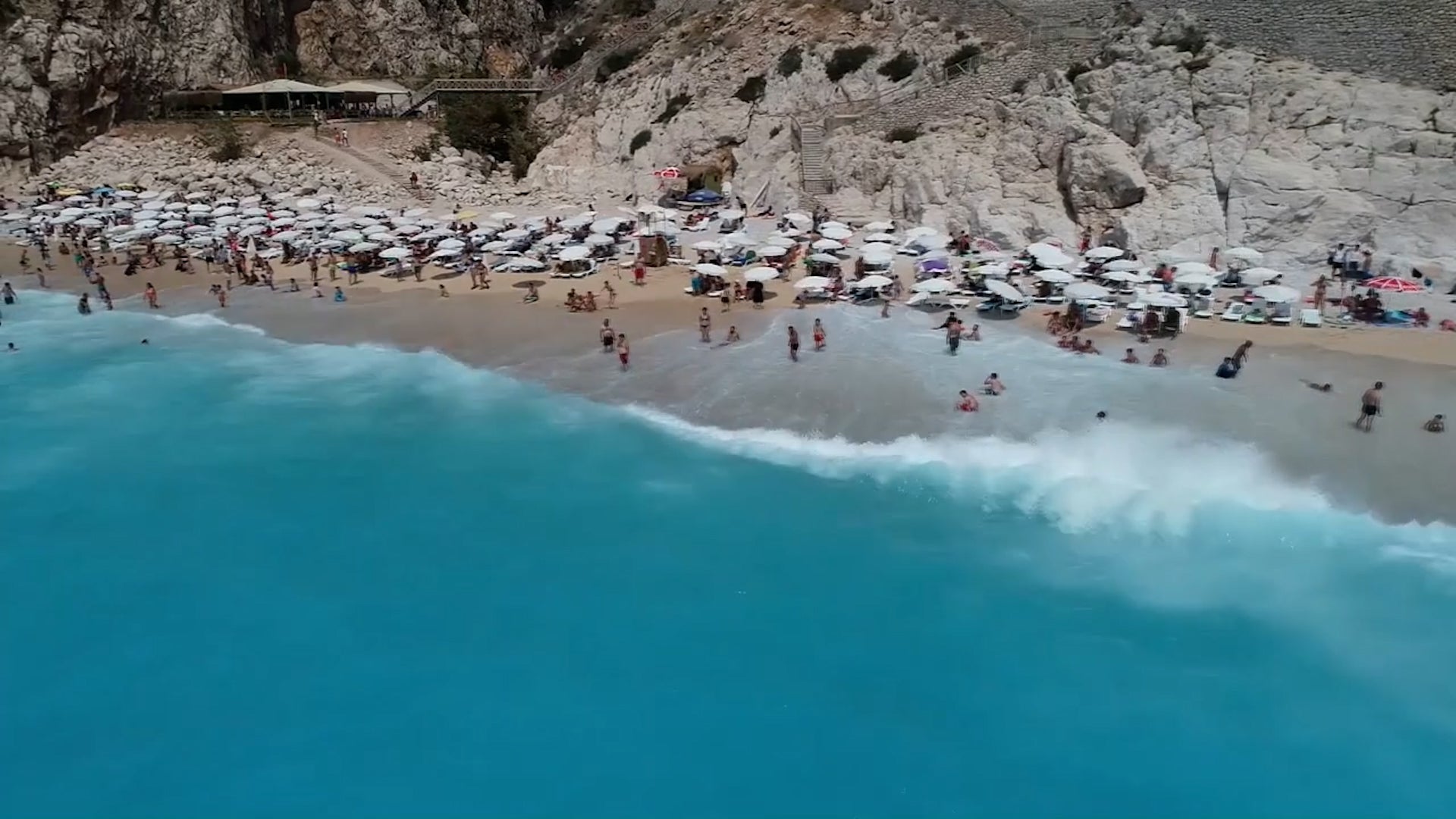
A travel agency collected images from Google Maps and cross-referenced them against the certified bluest shade of blue in order to find the beach with the bluest waters on Earth.
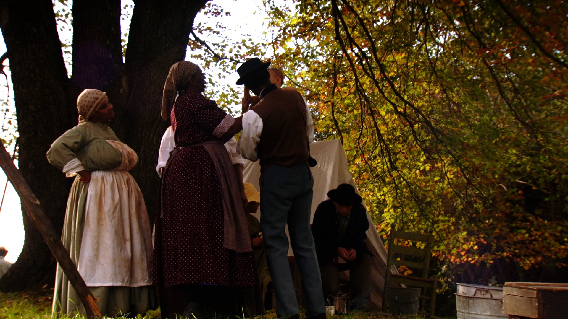
History lovers will have new places to visit and discover daring stories of escape and refuge for those who risked their lives to escape slavery in America. See where the National Park Service has added 19 new locations to its National Underground Railroad Network to Freedom.